

In 2020, the average US citizen spent about 5-6 hours every day on their cellphone.
That’s 1,825 hours a year!
For a business, that statistic is vital to understand and optimize your mobile web design to its fullest potential! Here at RevenFlo, we offer mobile web design services to finetune your web experience for any and all mobile users coming to your site.
You may wonder what the core elements are for making a website mobile-friendly. You’re in luck, because we’ve listed them all below!
Consistency
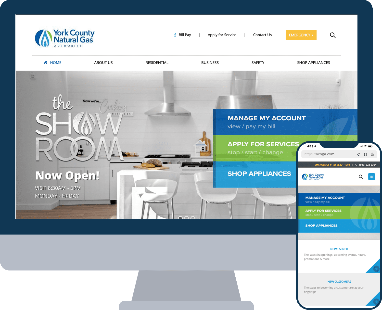
The first rule of mobile web design is consistency between desktop and mobile. The experience should be as similar as possible so that users visiting on each platform will all behave in generally the same way. Having an inconsistent experience on your site can make for frustrated customers. While they often have to be moved around for a smooth mobile experience, your site’s navigation menu, contact information, and other important content should be easy to find for users wherever they are on your site.
Another key element that needs to remain consistent is the site’s typography and brand look. Choosing a font that looks stable and legible in any size is key for mobile-friendly design, and having it remain consistent in any size or aspect ratio goes a long way. Along with this, keeping a stable color palette, logos, and fonts brings together a cohesive look rather than a drastic makeover that doesn’t align with your brand.
Functionality & Navigation
When designing a layout for a mobile site, always keep ease of navigation in mind. Making sure your navigation and functionality is simple and decluttered keeps mobile users from being overwhelmed and tapping away. Starting with a vertical scroll, one-column, minimalist approach gives you a great foundation for page functionality.
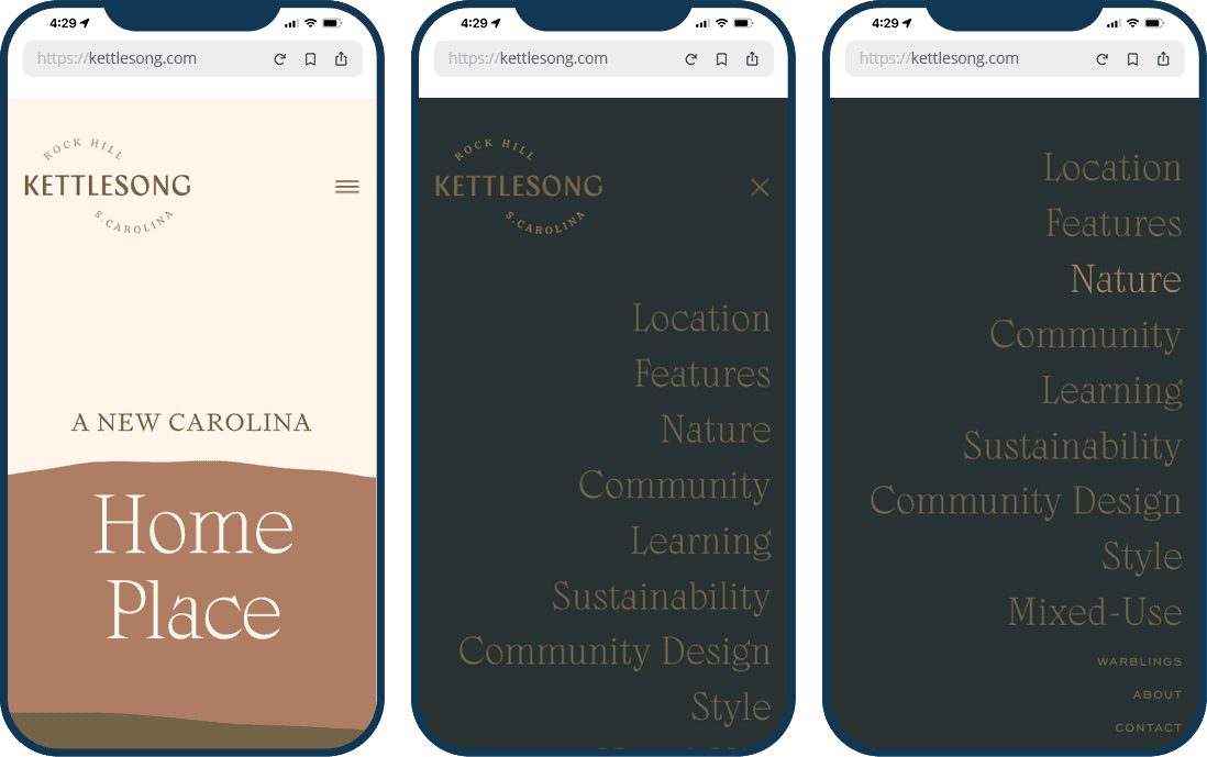
Thinking about navigation, it’s important to keep scannability in mind as you build a website. Users tend to not read web pages word by word but by quickly scanning the page for what they’re looking for. For this reason, having menus and headings clearly visible and distinguishable increases scannability, making navigation much simpler. The most important place for this is the site menu, as it lets users move freely throughout the site to the content you want them to see.
Simplicity
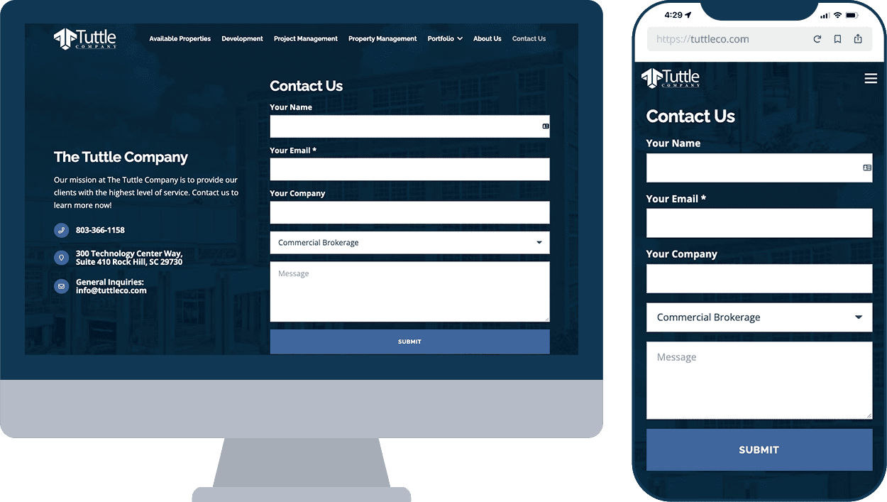
If you’re designing a website to be mobile friendly, keeping everything simple is better. If you were visiting your own site, what would annoy you? What would you want to see? A great example of this is a typical contact form that can be found on almost every site. Asking for the bare minimum and most essential information keeps it low effort to fill out and reduces the risk of users bailing before submitting. Next, think about your specific users. Are there certain pages on your site that they visit the most? This information can be garnered from Google Analytics or your site’s built-in analytics. After identifying this, you can determine where you need to start optimizing. Instead of trying to make every page mobile friendly at once, you may want to start with your most seen pieces of content. This is a great way to simplify mobile web design if you have limited time and resources.
Performance
Optimizing your site’s performance takes means taking site speed into consideration. Higher resolution images and videos will affect a page’s load time, but you don’t want small, blurry images either. Users are more likely to leave a site if content takes too long to load. You’ll want to keep track of certain metrics such as TTI (Time to Interactive) or CPU time spent in loading/rendering, as measuring your performance needs to be continually refined and monitored for the best performance. The ideal load time for a web page is 1-2 seconds, and if your site takes longer than 3 seconds to load on mobile, an average of 53% of users will leave.
Why Bother with Mobile-Friendly Web Design?
As we stated in the beginning, the average US user spends around 5-6 hours a day on their phone. Any company that relies on its website needs to think about how they can be part of those 5-6 hours. Mobile traffic is a necessity for a business in this day and age!
The most important thing to keep in mind is that your mobile website is most likely the first impression of your business. If your website is outdated, that fact will immediately have an impact on your audience. Mobile web design is vital because it helps determine how your audience perceives your brand.
A mobile-friendly site means it’s highly accessible and and is easy for users to interact with. Users will interact with a mobile-friendly site more, which in turn creates loyalty and retention. They will continue to come back, creating a stable base of users that will turn into more leads and conversions.
A mobile-friendly site encourages sharing. Content that is accessible and easily shared can be spread through different social media platforms and through text messages. It can help to think of your website as a customer service representative. If your site appears inviting, then users will be more likely to engage with it. Users use your website as an indicator for how your business will act with them.
This mobile accessibility further encourages credibility and trust to retain your regular users and establish that trust with new users. A mobile-friendly site shows that your business is reliable and legitimate. If you use your website to sell a product or service to your users, the last thing you want is for users to feel like it’s not secure or risky.
A mobile-friendly site also aids in search engine optimization. Google’s algorithm favors mobile-friendly websites, so if you want your site to rank higher in search results, you’ll want to make it more mobile friendly. Real people and Google search crawlers both prefer a site that is designed with mobile traffic in mind.
Having a mobile-friendly designed site is essential for a business. Your competitors have probably already optimized their websites for mobile, and if you don’t keep up they will outperform you. A well-designed site will set you apart and make sure users are coming to your business first.

RevenFlo Can Help with Mobile Web Design!
Contact us to talk about how we can help with all your web design needs. Our huge portfolio of web design projects illustrates the trust that our clients have put in us to deliver effective website development and design for desktop and mobile alike.